http://www.dbroot.com/FINANCIAL_PLANNING_PROCESS.aspx

http://www.financialplannerphiladelphia.net/financial-planner-philadelphia-a-sample-financial-plan/
http://calendarbudget.com/blog/the-financial-planning-process-simplified/
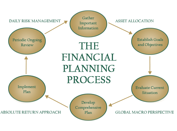
The first diagram shown is very simple and classic. It offers a very neutral color scheme which is not exactly boring but at the same time it does not pop out at you. The words used throughout the diagram are very simple as well. This seems like a diagram created by a CFP explaining to his or her customers a brief overview of what goes on throughout the office. The outer diagram words also help clarify all of these resources that this particular company has to offer. This information is presented in a circular fashion and helps establish the fact that financial planning is an ongoing process. I would rank this diagram second of the three diagrams I have posted.
The second diagram presents almost the same information but in a step by step format. They also chose a color scheme that works well together and stands out a little more than the first diagram. This step by step presentation can be just as good as the circle presentation being that the diagram can still hammer home the point that planning for your financial future is a step by step process. I find that in the last step of the diagram that the text stating to "update the plan" and the chosen color purple really help establish the fact that financial planning is a continuous process. The only thing this diagram is missing is a title labeling it a financial planning process. Because of that I would rank this diagram third out of the three diagrams I discovered.
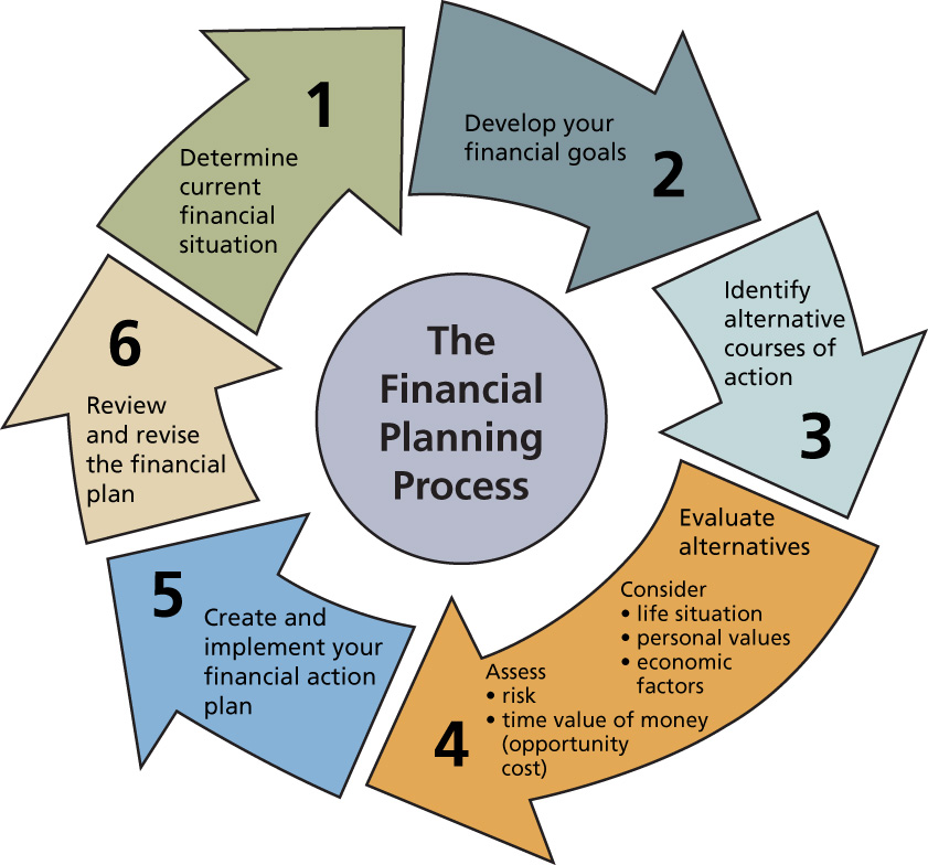
The last diagram is a great graphic to show how the financial planning process works. The colors do not pop out at you but they differ and by doing that they are letting you know that each step is independent of its own. The colors also work well together with the text. The circular format again establishes the revolving process that is financial planning. I find the arrows throughout the circle really make this graphic stand out and help implement that this is a step by step process in which you cannot skip any steps. The text in this diagram remains relatively simple and clear. The numbers help users follow the graphic and the words are chosen wisely. I like how they elaborated on the fourth step of evaluating alternatives. This diagram is the best out of the three that I had chosen and I would recommend this diagram to someone interested in the financial planning process over all others discussed in this assignment.
